The Hidden Accessibility Gap
Most product teams accessibility conversations stop at font sizes and screen readers. That's only part of the picture… and arguably not even the most pressing. Remember that if you design for the weakest reasonable conditions, you build a better service for everyone.

Ask a product development team about accessibility and you'll get a familiar answer: font sizes, colour contrast ratios, screen reader compatibility, keyboard navigation. All of that matters. But there's a version of inaccessibility that rarely comes up in those conversations - one that has nothing to do with visual impairment or assistive technology:
The additional questions you should be asking are: How are you serving users with poor connectivity? With outdated cellphones? With limited data plans? Will a company be able to keep workers safe and connected if they are working in a remote environment?
Designed for the office, not the field
Online services and customer facing apps tend to be built and tested under one set of conditions: a developer's workstation, an office Wi-Fi network, a modern browser. Given that it's the environment that teams work in, the pattern is understandable. But it can create a blind spot, because many of the people those services are meant to reach are operating under entirely different circumstances.
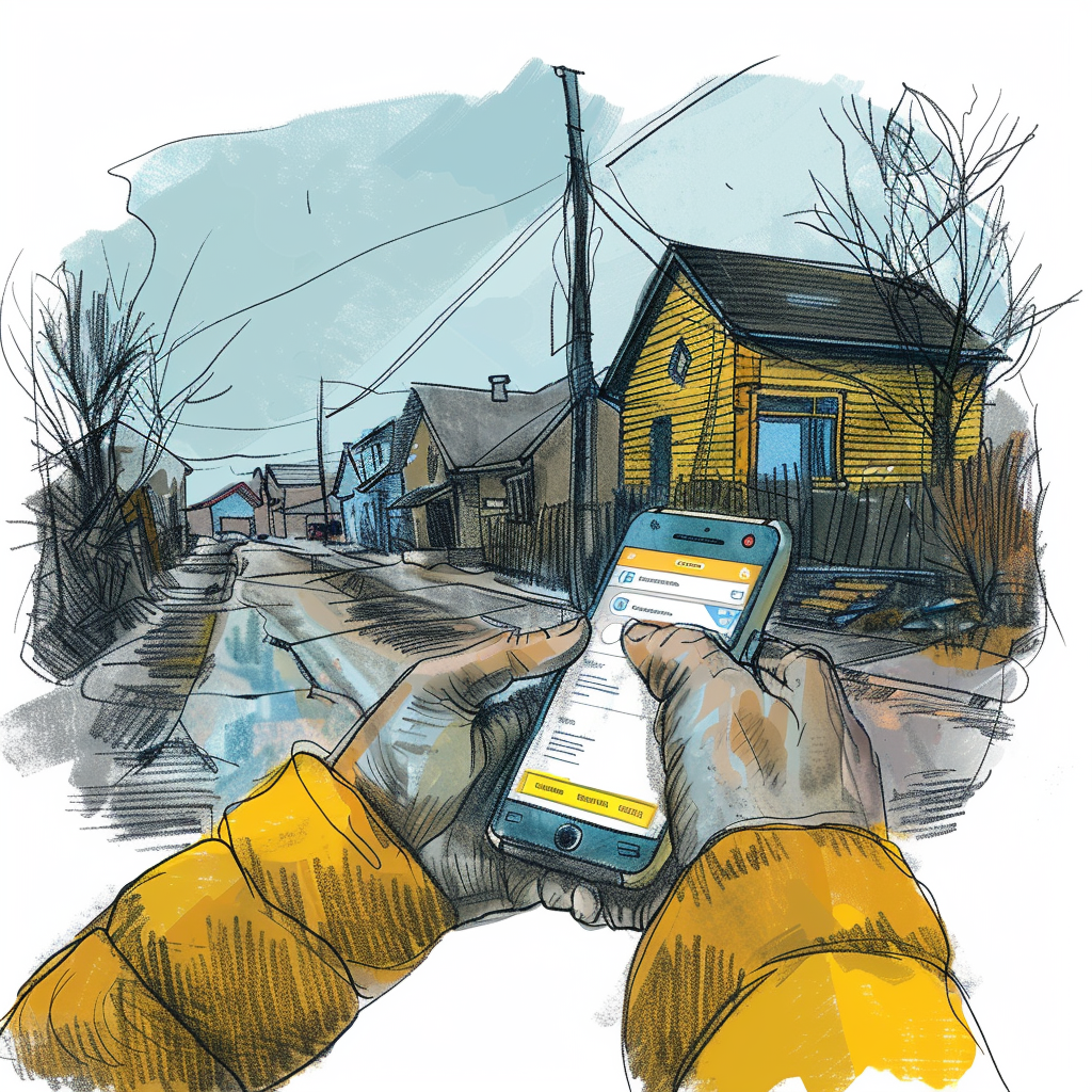
It’s important to step into the shoes of the user accessing online services: The family in a remote northern community sharing a mobile data plan. Or the seasonal worker in rural Manitoba with a three-year-old Android phone and intermittent 3G. Or perhaps a newcomer to Canada in a low-income urban neighbourhood who does everything on their phone because they don't have a laptop or home internet.
Serving these users effectively is imperative. Federal policy is clear that improving access to digital services for remote, rural, and underserved populations is a priority. Not an aspiration sitting in a strategy document, but a delivery requirement. And yet the services designed for exactly these groups are often the ones that fall apart when the connection is slow, the online form has trouble rendering, the device is older, or the data cap is nearly hit.
The mobile-first reality online services and customer facing apps keep underestimating
There's a well-documented relationship between income and how people access the internet. Low-income Canadians are significantly more likely to use a mobile phone as their primary - and often only - device for accessing online services. No desktop. No broadband at home. Just a phone, a plan, and whatever data is left in the billing cycle or reliance on public wifi networks.
This has real implications for service design that go beyond making a website "responsive." Responsive design is about layout adapting to screen size. What we're talking about is something different: whether a service can function at all for someone on a budget phone, a weak signal, and 500MB of data left until the end of the month.
Those are two different problems. Product teams often solve the first and assume they've solved the second.
What building for low connectivity actually requires
There are a set of deliberate decisions that need to be made early in a project to effectively deliver in a low connectivity environment, where many of Canada’s more vulnerable populations reside. Here are our top considerations:
Keep pages light. Every image, script, and third-party resource costs data - and on a limited plan, data is money. A form that loads six analytics scripts, a full-resolution header image, and a web font from an external Content Delivery Network can burn several megabytes before a user has typed a single character. Images should be compressed, non-critical scripts deferred, and anything that isn't essential to the core task should be cut.
Design core tasks to survive a dropped signal. The main thing a user needs to do - submit a form, check a status, upload a document - should work even when connectivity is intermittent. Caching key resources locally and queuing actions to sync when a connection returns are standard approaches, but they require intentional architecture from the outset.
Save progress automatically, and recover gracefully. Losing a half-completed application because the signal cut out isn't a minor inconvenience. For someone accessing a benefit portal during a lunch break with 15 minutes of data left, it can mean missing a deadline. Auto-save and local session storage should be standard on any form that takes more than a minute to complete.
Simple controls, short steps. Budget phones have smaller screens and less precise touchscreens than the devices developers test on. Tap targets need to be generous, and workflows should be broken into short, logical steps, not long scroll-heavy pages where it's easy to lose your place. Plan for small screens to reduce the additional cognitive load of a complicated interface.
Be honest about what you're asking for, especially location. Location-based features are more common in online services and customer facing apps than people realize: think service centre finders, geography-based eligibility, local program lookup. On mobile, GPS access drains battery, and loading a full interactive map can be expensive in both data and time. If location is necessary, explain why. Give users a text-based alternative. And consider whether a lightweight static map or pre-cached tile set could do the job instead of a full interactive rendering.
Test on real hardware in real conditions. This is where the gap between intention and delivery usually shows up. A service that performs well on a MacBook connected to office Wi-Fi can behave completely differently on a mid-range Android phone on 3G. Meaningful testing means using the actual devices that low-income and rural Canadians use, under network conditions that simulate weak or intermittent connectivity. Browser tools can throttle connection speeds, but there's no substitute for picking up a cheap phone and actually going through the service.
Maps are worth calling out specifically
Maps show up in online services frequently, and they carry particular risks for low-connectivity users.
Tile-based interactive maps - the kind built on Google Maps or Mapbox - can require several megabytes just to render the initial view. On a slow connection, that's a thirty-second blank screen, which most users will read as a broken page and abandon. On a limited data plan, it's also a cost the user absorbs.
The right question when a map appears in a service is whether it's doing work that can't be done another way. If it's providing context rather than enabling the core task, it should load on demand rather than by default. If it's central to the experience, explore lighter alternatives: static map images, simplified tile sets, or text-based fallbacks for location-dependent tasks. A user who needs to find their nearest service office should always be able to get that information without a data-heavy interactive render standing between them and the answer.
Tying in to the federal mandate
Canada's Treasury Board Digital Standards are explicit about building services that work for all Canadians - including those in remote, rural, and underserved communities. Accessibility in that framework isn't narrowly defined as assistive technology compliance. It covers the full range of conditions under which people actually interact with government services.
A service that works only for Canadians with fast internet and a modern device isn't accessible in any complete sense of the word. It works for some people. For the rest, it's just another barrier; which is why in order to break down this barrier, all developers need to be focused on accessibility.
Designing for the connection people have, not the one they would ideally have
At Button, we've worked on web applications for customer facing services where the intended beneficiaries were often in communities with limited connectivity or economic resources. What that work has reinforced is something straightforward: if you design for the weakest reasonable conditions, you build a better service for everyone…
Low-bandwidth optimization tends to produce faster, leaner, more resilient digital products across the board. Offline-capable architectures are more robust in general.
Simpler workflows reduce support calls.
None of this is a compromise, but just good design practice applied to the full range of people an online service is supposed to reach.
The question worth asking any digital team delivering public services is not "does this work?" but "does this work for the people who need it most?"
Button designs and builds government digital services with real-world use in mind — including the connectivity conditions that most projects don't test for. If you're thinking about how to reach more Canadians more effectively, we'd welcome the conversation. Find us at button.is.
Subscribe to Button Insight ✉️
Our twice-monthly digital services newsletter. Get our best tips, insights and resources delivered straight to your inbox!
Get in Touch!
We love to have conversations with decision makers, technology leaders, and product managers from government and industry. If that sounds like you, and you have a digital project you’d like to let us know about, please fill out our contact form.
Our business development team will reach out promptly.


Follow Us
Contact Us
Subscribe to Button Insight ✉️
Our twice-monthly digital services newsletter. Get our best tips, insights and resources delivered straight to your inbox!